Sunday, November 22, 2009

Meet A Giraffe

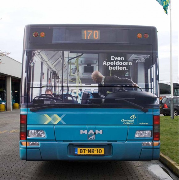
Advertisements are everywhere. In my sociology class, Professor John Hall posed a question to the class: could you operate in society without encountering advertisements? The answer for most is no. It is nearly impossible since advertisements are all over our world. From bus sides to billboards to computer pop-ups to banners flying off of airplanes, almost anywhere we go, advertisements will find us. We see so many that we often glaze over the ones that don’t catch our attention. That is why it is so great when an innovatively designed ad pops up right in front of you. That is what happened to me when I came across a giraffe on a side street in San Francisco a few months ago. Not a real giraffe, just a pole painted to look like one. It is an advertisement for the new arrivals of giraffes at the San Francisco Zoo. This creative ad, designed by BBDO West advertising agency, featured a street-lamp pole painted with a giraffe pattern topped by a flag with a giraffe face on it. This graphic design took an object that most people don’t notice and made it extraordinary. BBDO West turned a simple form into a design that interacts with the public. It is common for advertisements to be placed on banners high on street poles, but much more unexpected to use the pole itself as a design feature. It was a humorous and innovative way to accentuate the height of a giraffe to sell the giraffe experience to passerby.
(picture courtesy of ibelieveinadv.com)

Thursday, November 19, 2009

A Designed Future

As technology in our society progresses further and further, creating a sustainable society is becoming more and more essential. Designers create all the new technology and products coming into our world, so it is most important for designers to think sustainably. Yesterday, designer Nathan Shedroff spoke to my design class about sustainable design. Through a well-planned Power Point presentation, he explored how the three spheres of design, business, and sustainability can intersect. There are three main questions we need to ask ourselves: what does a more sustainable world look like; what does a more meaningful world look like; and what does a post-consumer world look like? “We don’t know the answers,” said Shedroff, “That is what design is for.” We can look to the country Cuba, a self-contained society that still uses cars from the 1950s, as an example of a sustainable world. We can look at the above-ground subway system in Curitiba, Brazil as an example of how to use a tiny amount of money for a major impact. We can look at the ban of outdoor advertisements in São Paulo, Brazil as an example of a post-consumer world. It may seem daunting to take on the huge task of redesigning our world sustainably, but Shedroff gave examples like these so we could find inspiration, giving us a jumping-off point for our own designs. But what is sustainable design exactly? Shedroff says there really is no such thing. The main thing to consider when designing is “don’t design things that make tomorrow worse.” So get out there yourself and design, design, design, for a better world for your kids and your grandkids.

Wednesday, November 18, 2009

Minimalize Me

Gary Hustwit’s film “Objectified,” features simply the people of design. The movie features how designers operate in society to create items we may not even know that we need. Hustwit chose to show designers at work interspersed with interviews on what design means to them. In the beginning of the film, designer Dieter Rams gives a long list of what design should be, ending with “design should be as little design as possible.” This theme of simplicity is consistent throughout the film. Jonathan Ive, a senior executive at Apple, described the process Apple designers use to make things smaller and simpler, such as the Macbook Air. One of their most important tasks is figuring out how to make “6 parts into 1.” The French Bouroullec designers said that the hardest part of their job is to “remove, remove, remove” to bring the greatest unity to the design. Designers have to remember and consider that most of their designs end up in a landfill, said Tim Brown, one of the founders of IDEO, insinuating that using as few resources as possible to create a design is best. The form of the movie echoes this theme of simplicity. There are no fancy voiceovers, no shocking scenes, just real designers in their environments. Scenes smoothly transition from one designer to the next, taking, for example, Bouroullec’s mention of Marc Newson to a scene of the designer in action. This pared down film will be understood by a wide range of audiences throughout society because of its elegant simplicity.
(picture courtesy of boingboing)

Tuesday, November 17, 2009

Mix It Up!

Whether it is through mixing paint, pencil, or pastel, new colors have been made by combining the old for centuries. Millions of different hues, tints, and shades have been created in this manner, but there are qualities of color and light that mixed pigments can never address. Visual color mixing aims to “reproduce the luminous and brilliant quality of life,” wrote Lauer and Pentak in Design Basics. In visual color mixing, two colors are placed side by side, and when viewed from a distance are seen as a mix of the two. Basically, our eyes mix the colors for us. It is used to communicate a more realistic sense of light in color. This is found in art styles such as pointillism, like in Seurat’s famous “A Sunday on la Grande Jatte,” or in Chuck Close’s grid style portraits. Visual color mixing can also be used to create different textures or design properties. Iridescent fabrics are not composed of glossy thread, as one might think, but of matte threads of two colors. For example, in a maroon colored iridescent fabric, there is black thread lengthwise and red thread widthwise. When the red peeks through the black, the colors mix to make not only a new color, but a new property of iridescence as well. Visual color mixing can be used in all other sorts of design in our society, whether it be in a multi-colored fiber rug in an interior, in a poster for a new band, or even in the pixels on our television screen. Try playing around with different materials, maybe you too can find a new design property using visual color mixing.
(picture courtesy of Nosideup)

Sunday, November 15, 2009

It's All An Illusion

Optical illusions have been fascinating scientists for centuries. Illusions are things that our mind creates out of what we see, despite what the true facts are. For example, the classic afterimage illusion. Joseph Albers describes this illusion in his book Interaction with Color. He tells us to look at a color, red, for 30 seconds, then look at a white piece of paper. We will see the color’s complement, green. The main scientific theory behind this is that the eyes contain nerves that sense the three primary colors, red, blue, and yellow. When we stare at the red dot, the red-sensing nerves become fatigued, so that when we shift to the white paper we see a combination of the leftover nerves, yellow and blue, creating green. This and other illusions can be very useful in design. They can be used to create volume, like in the floor tiles of the Basilica of St. John Lateran, which make a pattern of 3-dimensional boxes out of strategic placement of lines, or to create optical interest, like the café wall illusion, where parallel horizontal lines are made to seem diagonal by staggered black squares. Certain areas of design, such as interior design, depend on optical illusions to create space and openness. Fashion design has also used optical illusions, the most recent example being Givenchy’s spring 2010 show, where black and white patterned leggings and tops created an illusion of movement, almost appearing to move themselves down the runway. They have also been used in many ad campaigns and other media. It is in these kinds of examples that design elements coincide with science through optical illusions.
(picture courtesy of style.com)

Friday, November 13, 2009

Subjected

Color is found everywhere in our world. Look out into the world and you will see a million colors reflected back at you. But color is simply a figment of our perception. As the philosopher Goethe said, perception is subjective. Our perception of what we see is based on our past and what has influenced and impressed us. Therefore, when I see blue, I may be reminded of warm past summers spent by the ocean, but you may be reminded of frozen winters in Maine. These memories affect how we feel about the colors, and consequently what our color preferences are. So what does this have to do with design? Color choices are integral factors in design compositions. The color a designer picks will influence the viewer’s opinion of the design, so the designer has to pick a color that is likely to evoke the proper sentiment. For example, in the latest spring runway shows, many designers, like Zac Posen and Versace, chose to work with traditional spring colors, pinks, greens, light blues, and oranges. The colors suggest youthfulness, fun, and energy, a few defining factors of the spring season. But other designers purposefully stayed away from using such colors to induce different emotions in the viewers. Balmain’s ready-to-wear line featured army greens, blacks, and golds, to suit a tough but luxurious girl. Had the same outfits been done in pinks and greens, this may have fell in with the perky lines of Zac Posen and Versace, but the color palate chose the gritty mood.
(pictures courtesy of style.com)

Sunday, November 1, 2009

The Prince of Prints

The infamous Pucci and Missoni clothing houses are best known for one thing: pattern. Pattern is the predictable repetition of an element in an image. It is used to add texture and visual interest to an image. In design, pattern is an easy way to make a simple shape more dynamic. Pucci has designed simple beach-friendly clothes since the 1950’s, continually innovated by using variations on the house’s signature swirled, kaleidoscope patterns. These orange, blue, pink, and green patterns create a visual texture that granted the founder, Emilio Pucci, the title “prince of prints.”
The house of Missoni has also used their signature zigzag weaves to update simple knits. Their geometric prints not only have visual texture, but because of the knit fabric they are made in, have
tactile texture as well. Their patterns appeal to our basic love of texture, so it is almost an impulse to want to feel Missoni’s pieces. I remember walking through a department store and finding a beautiful Missoni knit zigzag shirt and instinctively reaching out to feel the texture that I could see in the pattern.
These two fashion houses have inspired so many others to invest in patterns as a way to enhance almost any design. Their inspiration does not only extend to fashion, but to art, interior design, and even food styling! Next time you shop, make sure to look out for patterns inspired by Pucci and Missoni, for these kinds of designs can be found almost anywhere in our society.
(Pictures courtesy of Fashion Models and Modeling Jobs and The Sartorialist, respectively)